

The purpose of graphical information is to show complex data in a very simple way. Not always the case, it is common for researchers and academics to get tripped up by graphs, questioning why something is represented the way it is, or, better yet, why some graphs appear to be unnecessarily complicated. Graphical excellence, then, is important because it applies to graphs that communicate complex ideas with better clarity and more efficiency.
The simplest way of thinking about graphical excellence is an example of flipping the page of a textbook, turning to a graph, or chart, and not having to pour over every graphical element to understand what is going on in the chart. In other words, the graph “just makes sense” upon viewing.
The reader is able to connect the proportion of quantities to their representative size and other graphical elements on display. The reader is also able to come up with new ideas and insights upon looking at the graph; something they didn’t get from reading the text. Sometimes it is the case that graphical excellence is embedded into lectures, and sometimes it is the case that graphical elements can confuse learners outright.
Graphical Integrity
In order to attain graphical excellence, graphical integrity is required. Graphical integrity refers to a series of principles that need to be followed in order to not show data out of context. One of the main principles of graphical integrity is clear and detailed labeling, which also applies to colors and color keys, as well as representations of numbers that should match their true proportions.
As an example, we can think of a graph that does not have graphical integrity and what the impact of looking at this graph is when trying to pull out key information. If we imagine a line graph that has six different elements along the X-axis, it would also make sense if these were all varying in quantity to have them shown in different colors. Why? Simply put, regardless of what is on the Y-axis, it makes the graph much easier to read when every element along the X-axis is a different color. This method of color coating goes a long way because it also makes the key of the graph extraneous, and is implicitly understood after looking at it once.
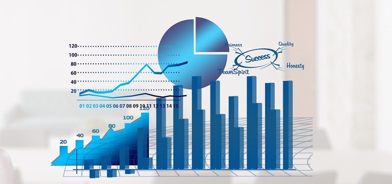
Likewise, one method of achieving graphical excellence is through the use of pie charts, as pie charts generally don’t distort color imbalances and give justice to proportionality. The implicit knowledge that the whole of the circle represents “1” is fairly well known, and helps readers visually see how each portion of the pie is being filled in. Pie charts can be useful when we think about the following:
- A countries annual GDP through sectoral influence
- A countries major exports/imports
- How an organization spends its time
- How an organization allocates its budget
- A farmers share of their most profitable crops
- Materials or resources used for construction
Graphical Excellence and Real World Applications
While many creators of graphical information make sure that the information they are communicating through the use of graphical elements is accurate, it’s important to realize that not everyone with the authority of creating graphs, or releasing them to the public, is trying to achieve graphical excellence.
The news and different media outlets, for example, might try to use graphs to distort the truth about a particular issue, or set an agenda for what citizens should be focusing on with regard to key statistics. This way of “cherry picking” information is very prevalent in our society, so one of the benefits of having a keen eye for graphical information, and graphical integrity, is really to understand when the truth is being distorted, and why.
The coronavirus pandemic has been an interesting time for graphical integrity mainly because of the shock value of some of the graphs we’ve been looking at, especially with regard to case counts and infection rates. But right now is also a time when many statisticians have shown graphical integrity when creating their data visualizations, and such information being shared on social media platforms has been easy to read, easy to understand, and makes an efficient use of our News Feeds. Especially at a time when many social networks have become saturated with misleading information.
Thus graphical excellence, while important for academia, and helping researchers make efficient use of their time and speed up learning processes, also helps society stay informed when crises or other current events threaten to spread misinformation.

